A World in Color
Amaryllis Storm
January 2019
I am not an artist by any means but still, it amazes me how some of my creations can make me happy when I have completed them. In this edition, I played around with two methods of coloring.
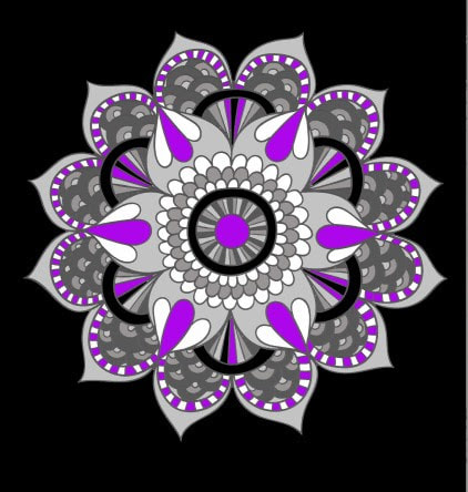
The first one was done entirely on the computer, for this one I wanted to see how various shades of grey and black would look with highlights of white and purple. I called this one: A Contrast in Colors.
I am not an artist by any means but still, it amazes me how some of my creations can make me happy when I have completed them. In this edition, I played around with two methods of coloring.
The first one was done entirely on the computer, for this one I wanted to see how various shades of grey and black would look with highlights of white and purple. I called this one: A Contrast in Colors.
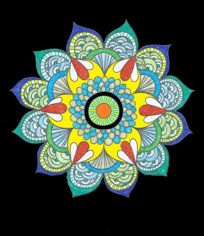
The second one I did with three mediums: markers, colored pencils, and a computer. The color scheme is green and blue with white, yellow and orange highlights. I chose a light and dark for each medium, light and dark pencils in blues and greens. I did the same for the markers for a total of for colored pencils and four markers. The highlights of yellow and orange were done on the computer. The white are spaces I chose not to color. This is the result of that combination: A Contrast of Medium.
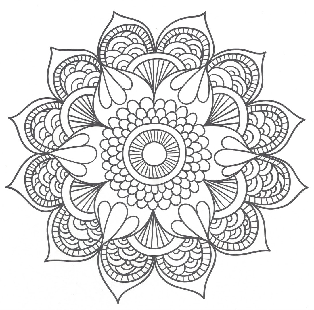
Using colors in various ways brought different parts of the mandala to the forefront. I find that one technique draws your eyes toward the center, while another pulls your gaze outwards to different parts of the drawing. Here is your blank canvas to create your own masterpiece! Have fun!